MonkiBox
MonkiBox
MonkiBox
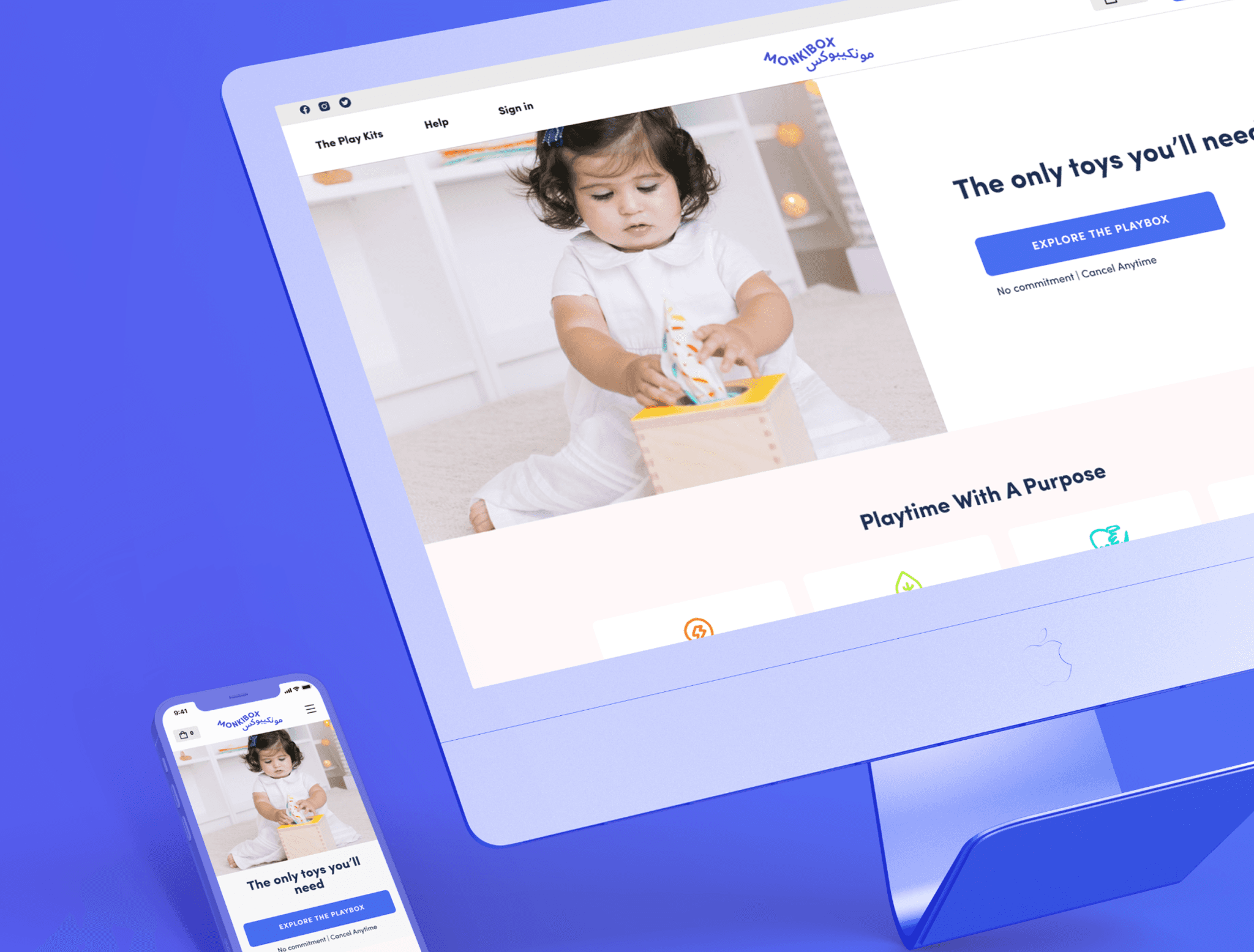
This case study focuses on the redesign of MonkiBox, a Shopify store based in the UAE that offers subscription-based Play Kits tailored to support the developmental needs of newborns and young children.
This case study focuses on the redesign of MonkiBox, a Shopify store based in the UAE that offers subscription-based Play Kits tailored to support the developmental needs of newborns and young children.
This case study focuses on the redesign of MonkiBox, a Shopify store based in the UAE that offers subscription-based Play Kits tailored to support the developmental needs of newborns and young children.
While the store's marketing effectively attracted visitors, there was significant confusion regarding the subscription plan, leading to: • A low conversion rate of 2%. • Reduced customer satisfaction and retention. The goal of the redesign was to clarify the subscription process, improve accessibility, and increase conversion rates, targeting a significant improvement from 2% to 100%.
While the store's marketing effectively attracted visitors, there was significant confusion regarding the subscription plan, leading to: • A low conversion rate of 2%. • Reduced customer satisfaction and retention. The goal of the redesign was to clarify the subscription process, improve accessibility, and increase conversion rates, targeting a significant improvement from 2% to 100%.
While the store's marketing effectively attracted visitors, there was significant confusion regarding the subscription plan, leading to: • A low conversion rate of 2%. • Reduced customer satisfaction and retention. The goal of the redesign was to clarify the subscription process, improve accessibility, and increase conversion rates, targeting a significant improvement from 2% to 100%.
Client
Client
MonkiBox Freelance Project
MonkiBox Freelance Project
Services
Services
UX Research User Journey Map Comptitor Research User Interface Design Usability Testing
UX Research User Journey Map Comptitor Research User Interface Design Usability Testing
Teams
Teams
1 UX Designer 1 Brand Designer 1 Marketer 1 Developer 1 Founder and Manager
1 UX Designer 1 Brand Designer 1 Marketer 1 Developer 1 Founder and Manager
Duration
Duration
Jan 2022 - Mar 2022 · 1 Month
Jan 2022 - Mar 2022 · 1 Month
Discovery
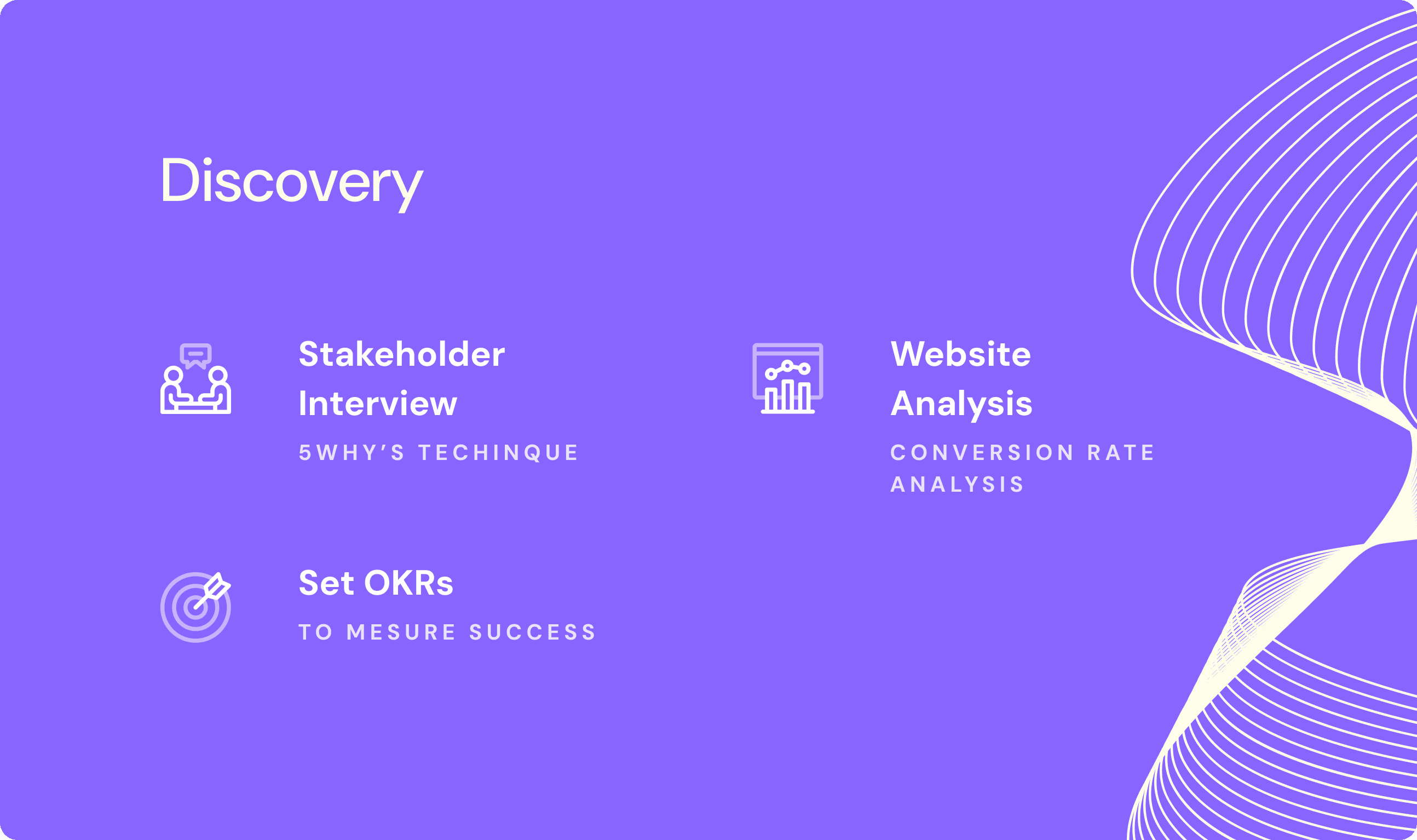
Stakeholder Interviews
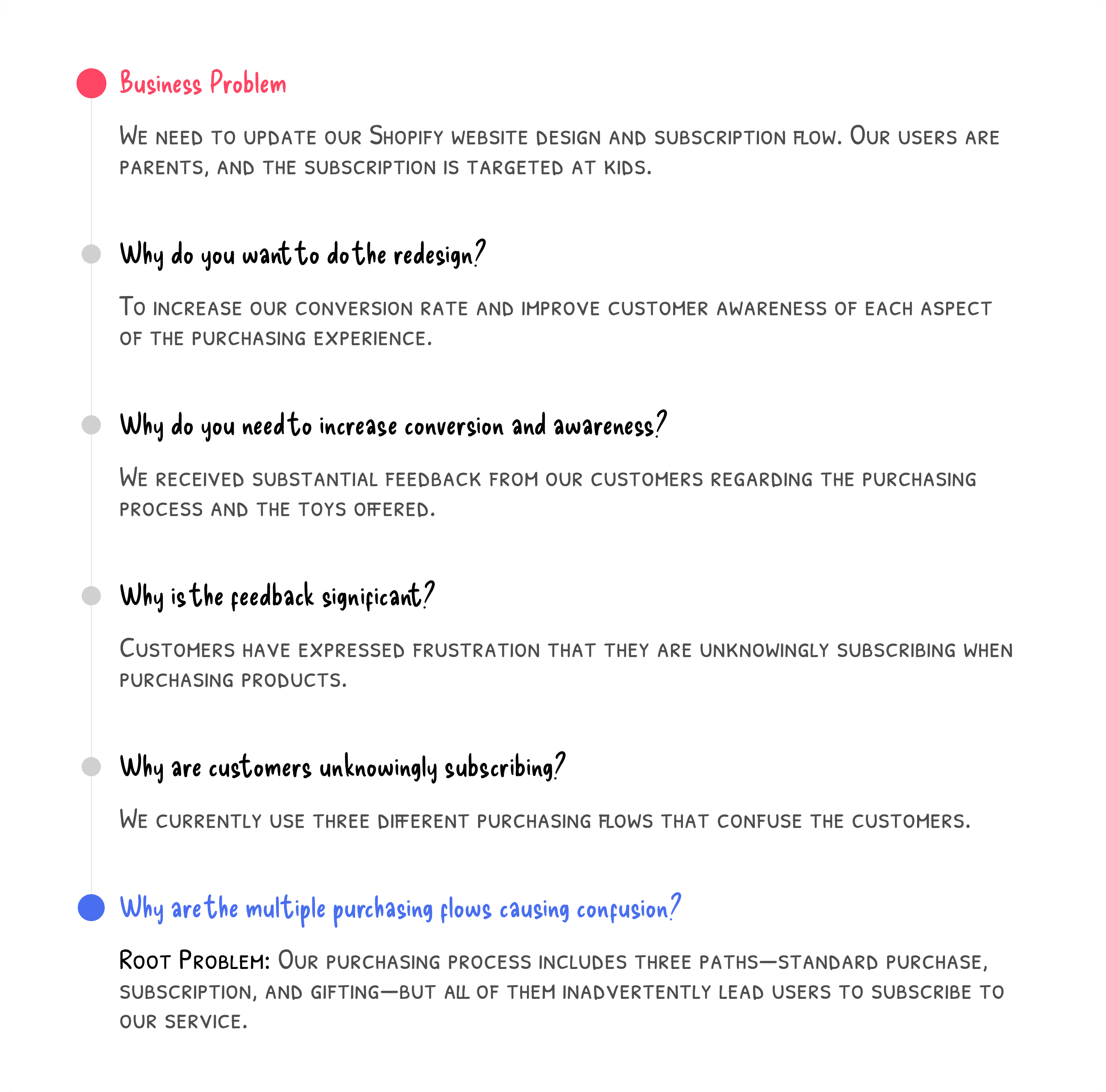
To understand the key issues, I applied the 5 Whys Technique during stakeholder interviews to dig deeper into the problems:
Business Problem: The client needed to update their Shopify design and subscription flow to improve the purchasing experience for parents.
Core Issue: Customers were being unintentionally enrolled in subscriptions due to a confusing purchasing process with multiple paths (standard purchase, subscription, and gifting).
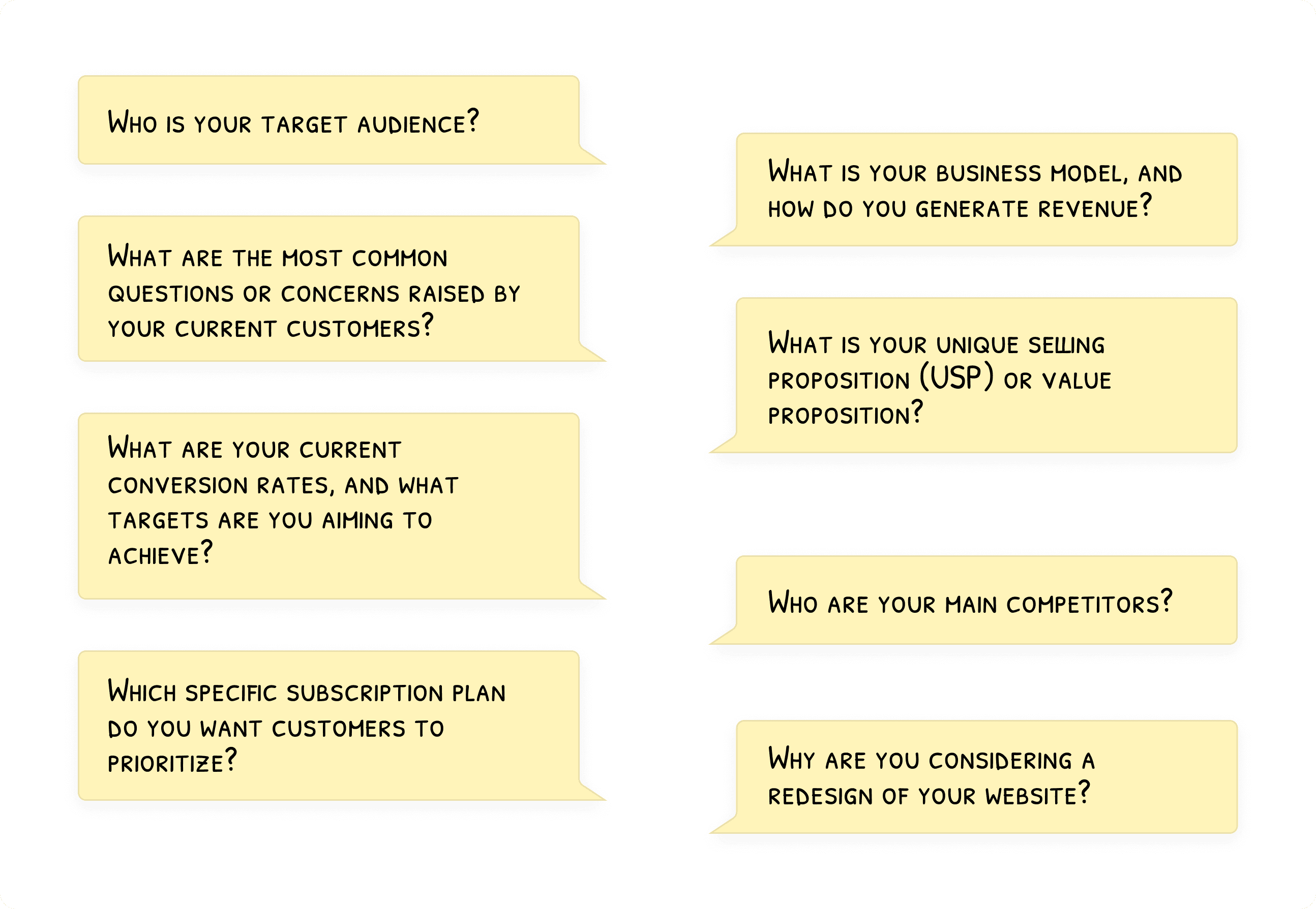
Additional Questions
I also asked stakeholders additional questions to gain deeper insights into the business model, target audience, and user pain points.
Setting OKRs
Based on these discussions, we established OKRs to measure the success of the redesign.
Some of the information we gathered came from the sales team, who are familiar with the common questions customers ask. For example, one recurring concern from parents is whether the products are made from materials that could contain sharp edges or other hazards that might harm their baby.
Website Analysis
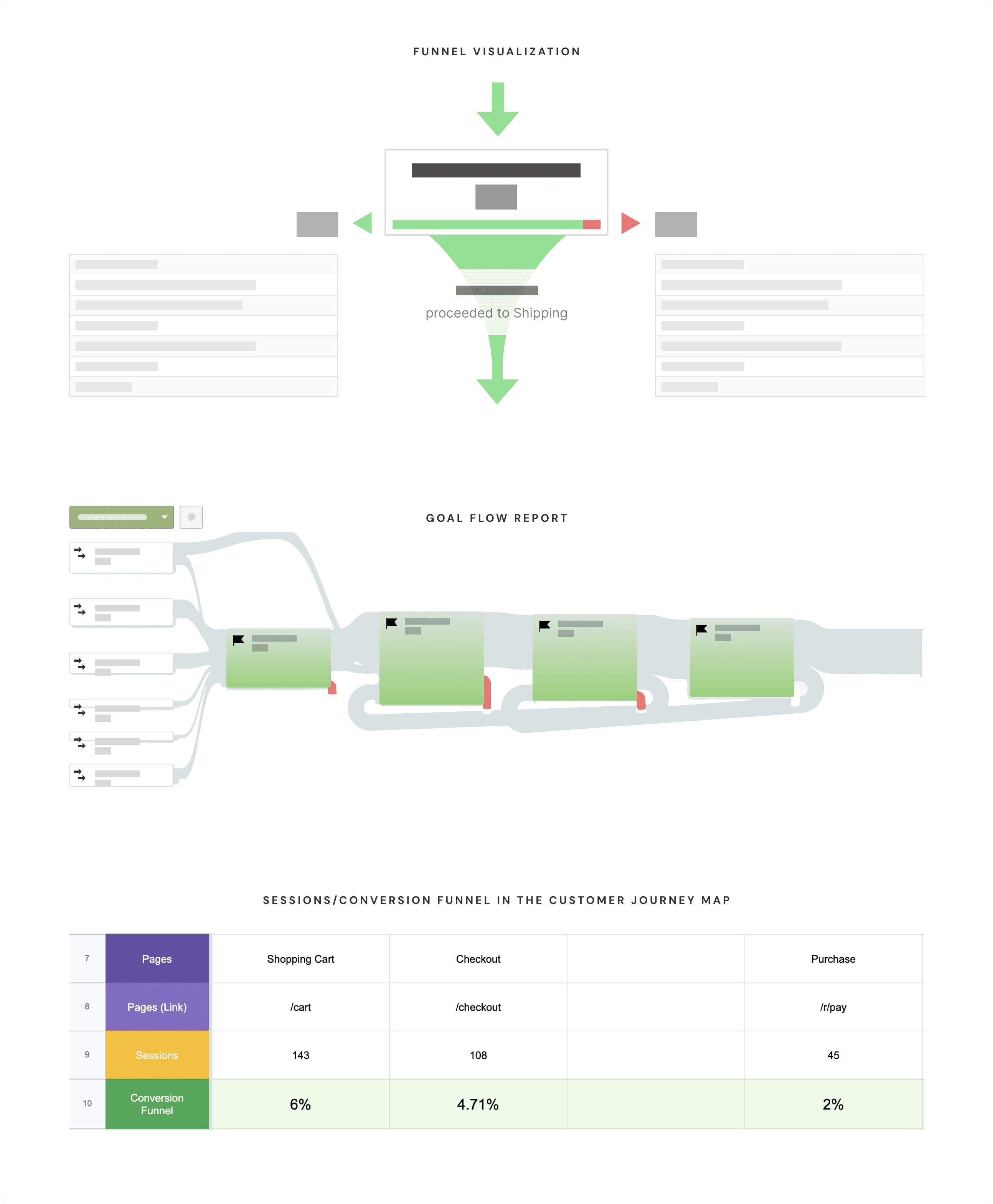
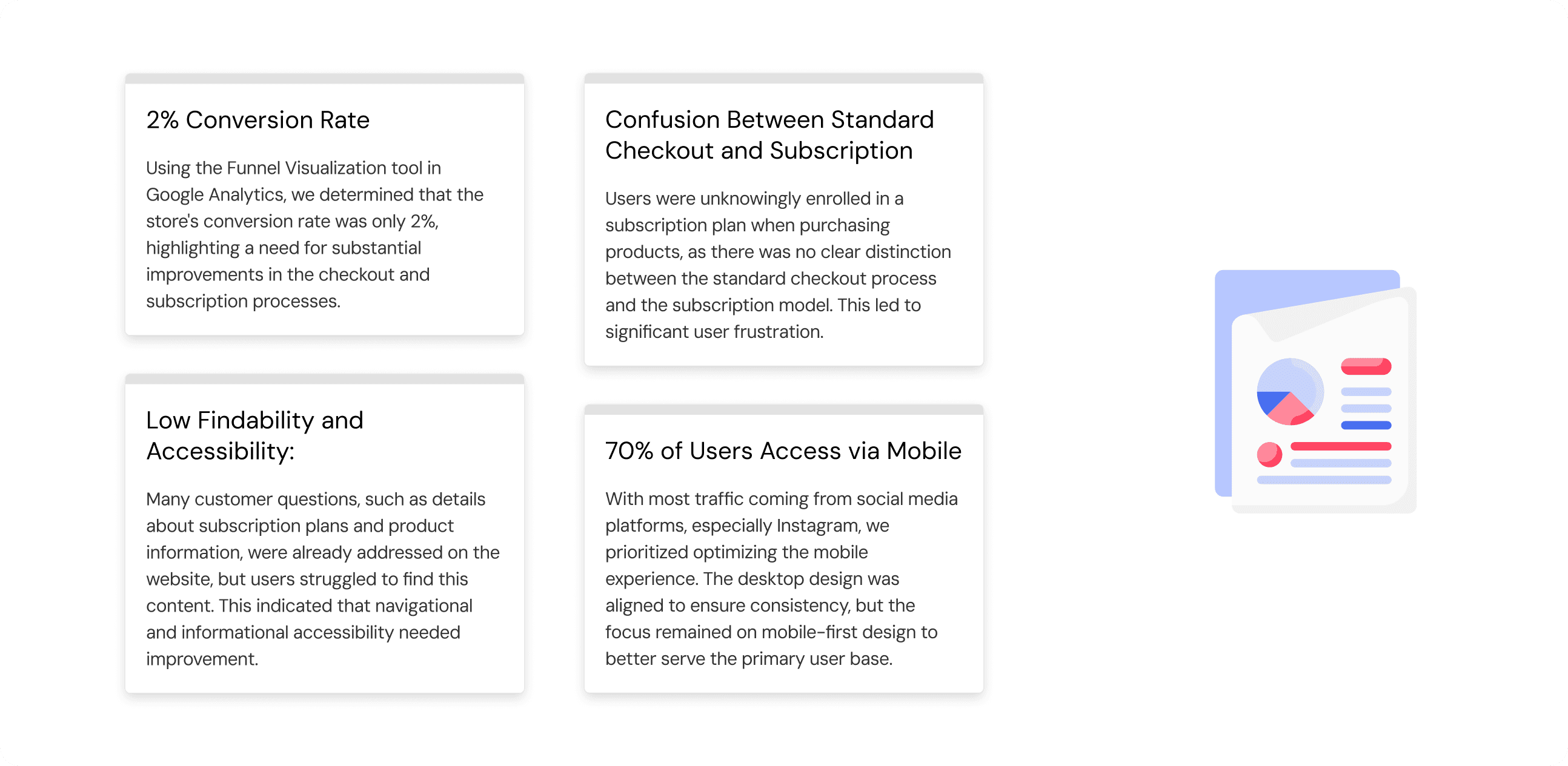
To verify user behaviors and conversion issues, I conducted an analysis using Google Analytics. By leveraging the Funnel Visualization tool, I identified key problem areas in the checkout process, particularly around confusion over subscription and product purchases.
Conversion rate: 2%
High mobile usage: 70% of users came from mobile, mostly through Instagram, highlighting the need for a mobile-first redesign.
Researching conversion rates and user behavior, then documenting the findings in the customer journey map.
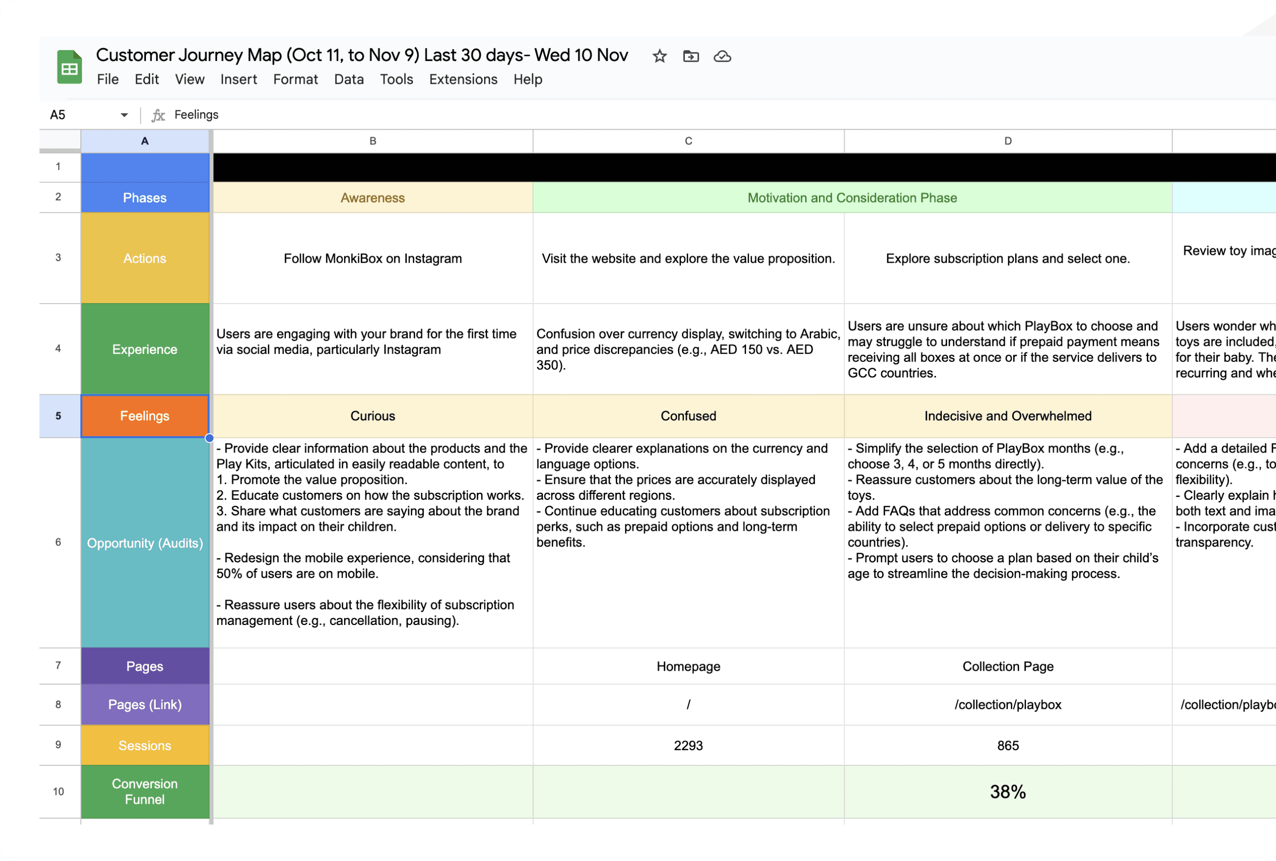
Define
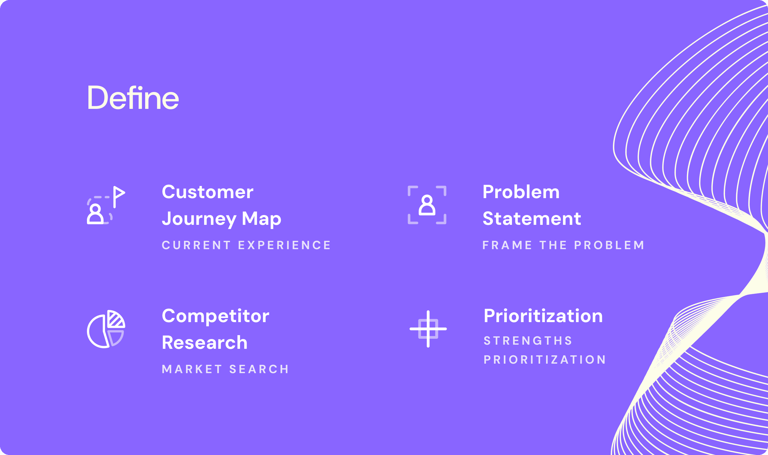
Customer Journey Map
A customer journey map was created to visualize the different touchpoints and phases that users experience, from discovery to checkout. This map helped identify opportunities for improvement in navigation, subscription clarity, and user engagement.
Research Insights
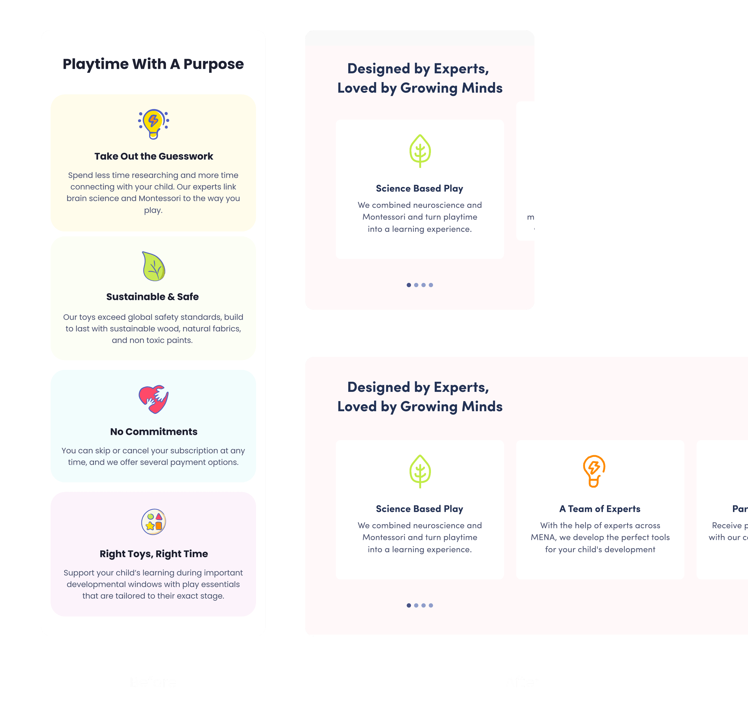
Based on my research, I identified the following insights:
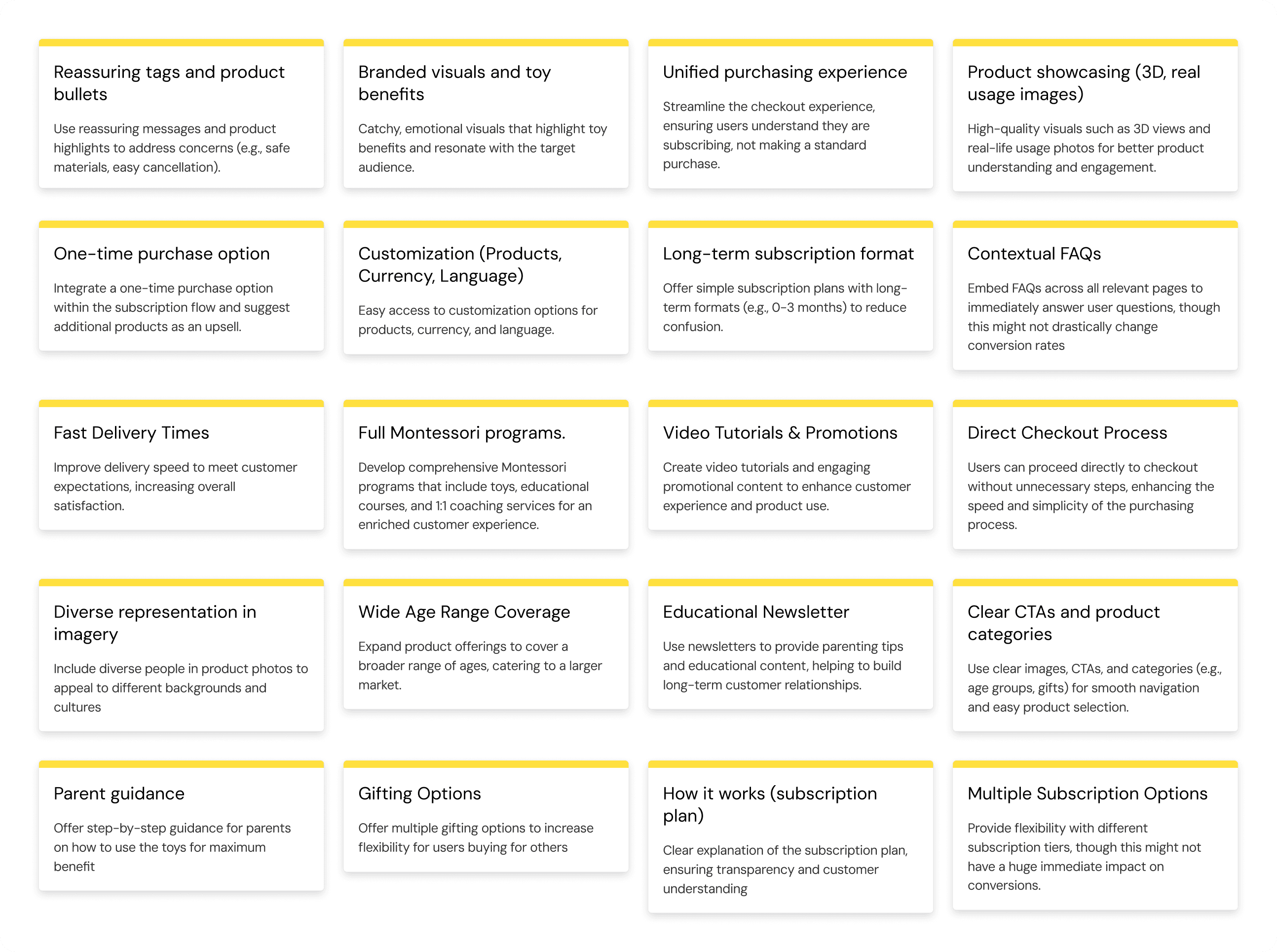
Competitors Research
I conducted a competitor analysis to understand how other brands address similar challenges. Key insights included:
Lovevery:
Strong brand identity with clear product showcasing and supportive guides throughout the journey.MontiPlay:
Good use of video tutorials and long-range subscription formats but poor UX practices.MontiKids:
Comprehensive educational programs but limited subscription flexibility.KiwiCo:
Engaging visuals and broad product offerings, but difficult access to product information for specific age groups.
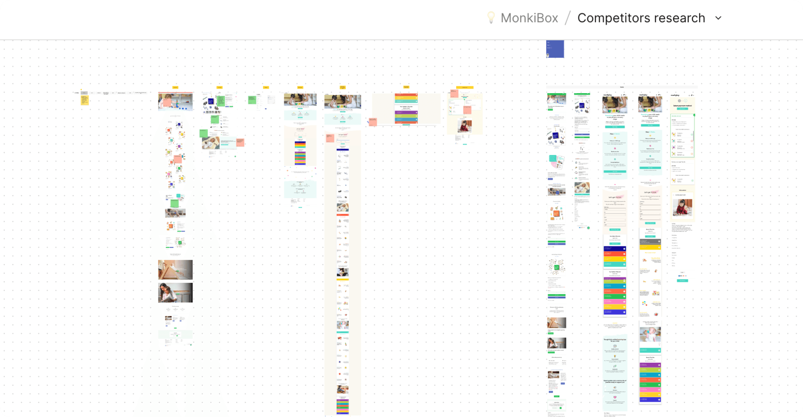
1. Conducting an in-depth audit of competitors and their mobile app designs.
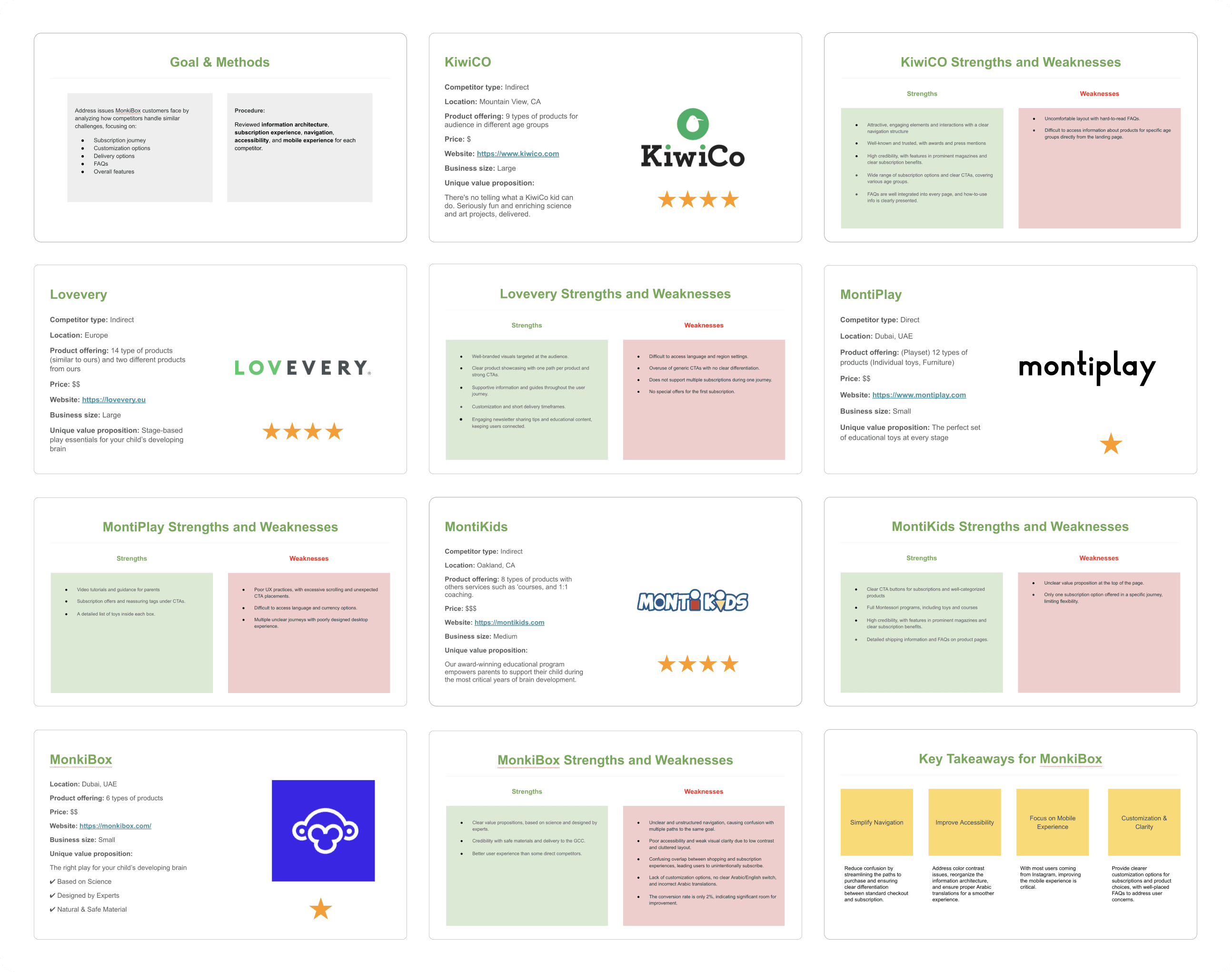
2. Summarizing each competitor's strengths and weaknesses.
3. Comparison of Strengths and Weaknesses.
Prioritization
We prioritized features and solutions based on their impact and effort. Features that offered the highest impact with the least effort were prioritized for implementation, such as clear subscription explanations, reassuring tags, and improved mobile navigation.
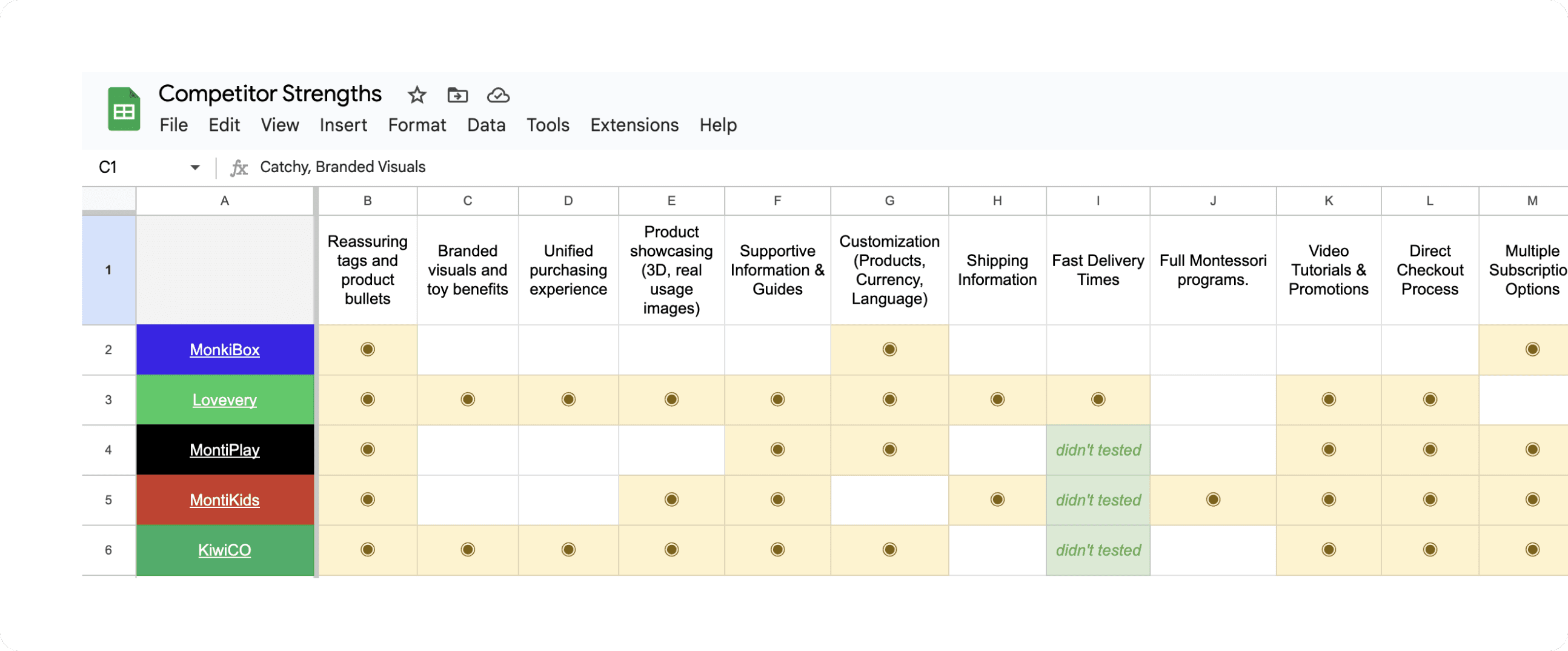
Competitor Strengths List
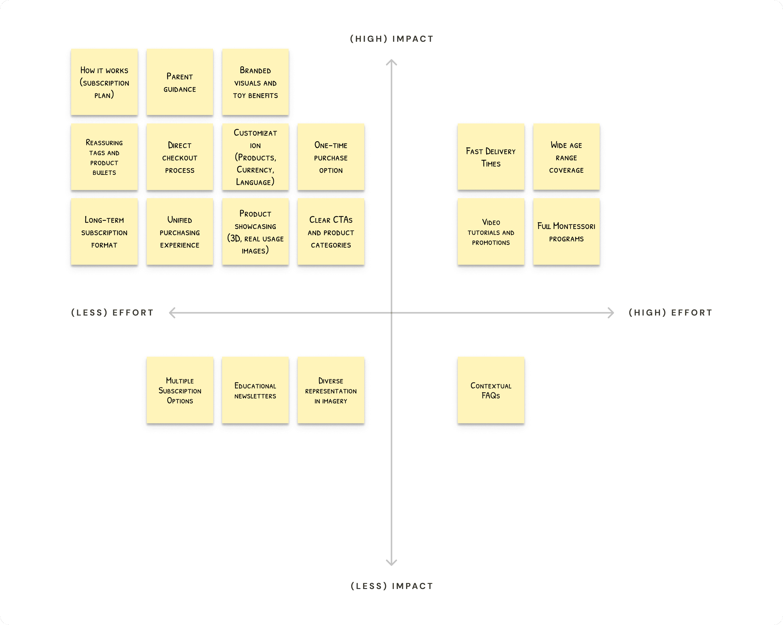
Matrix prioritization of competitor strengths was completed in collaboration with stakeholders to prioritize strengths that can be incorporate into our product and platform.
Design
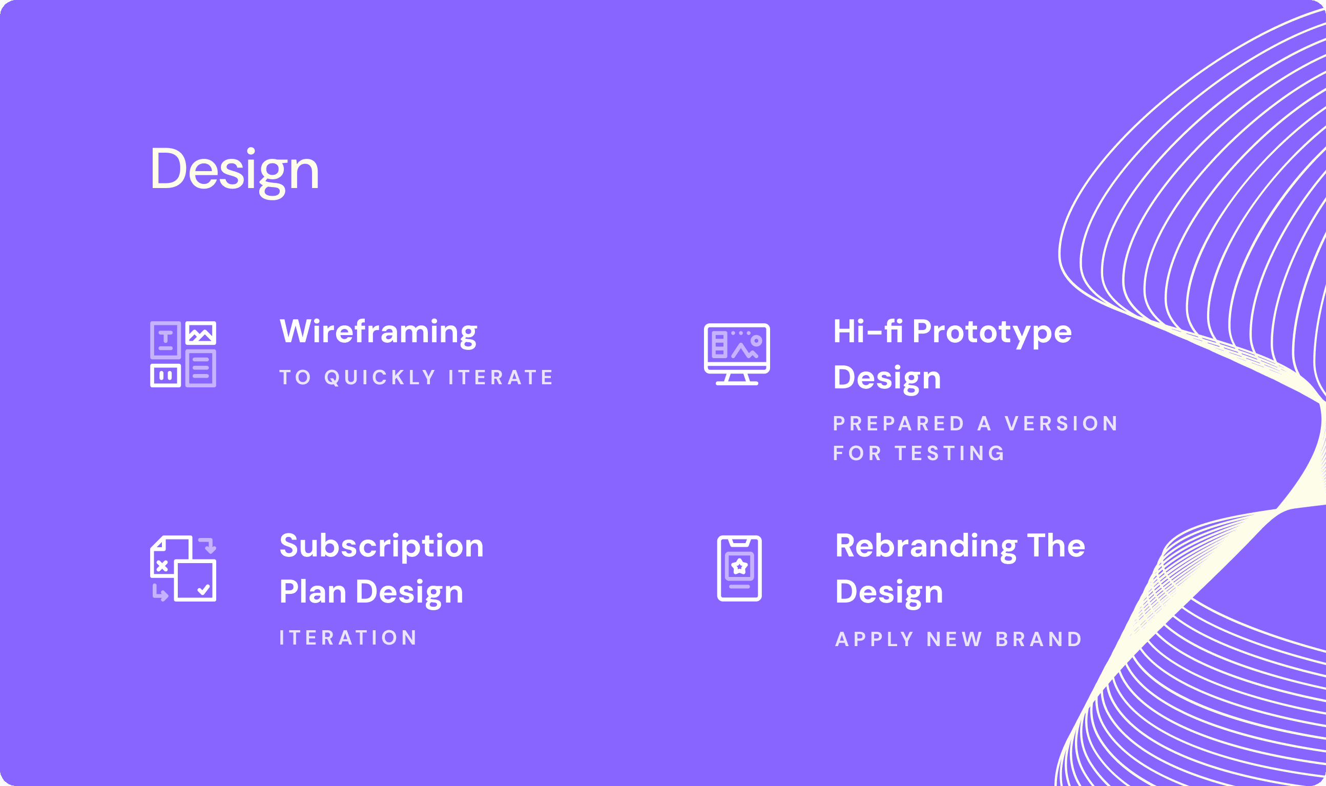
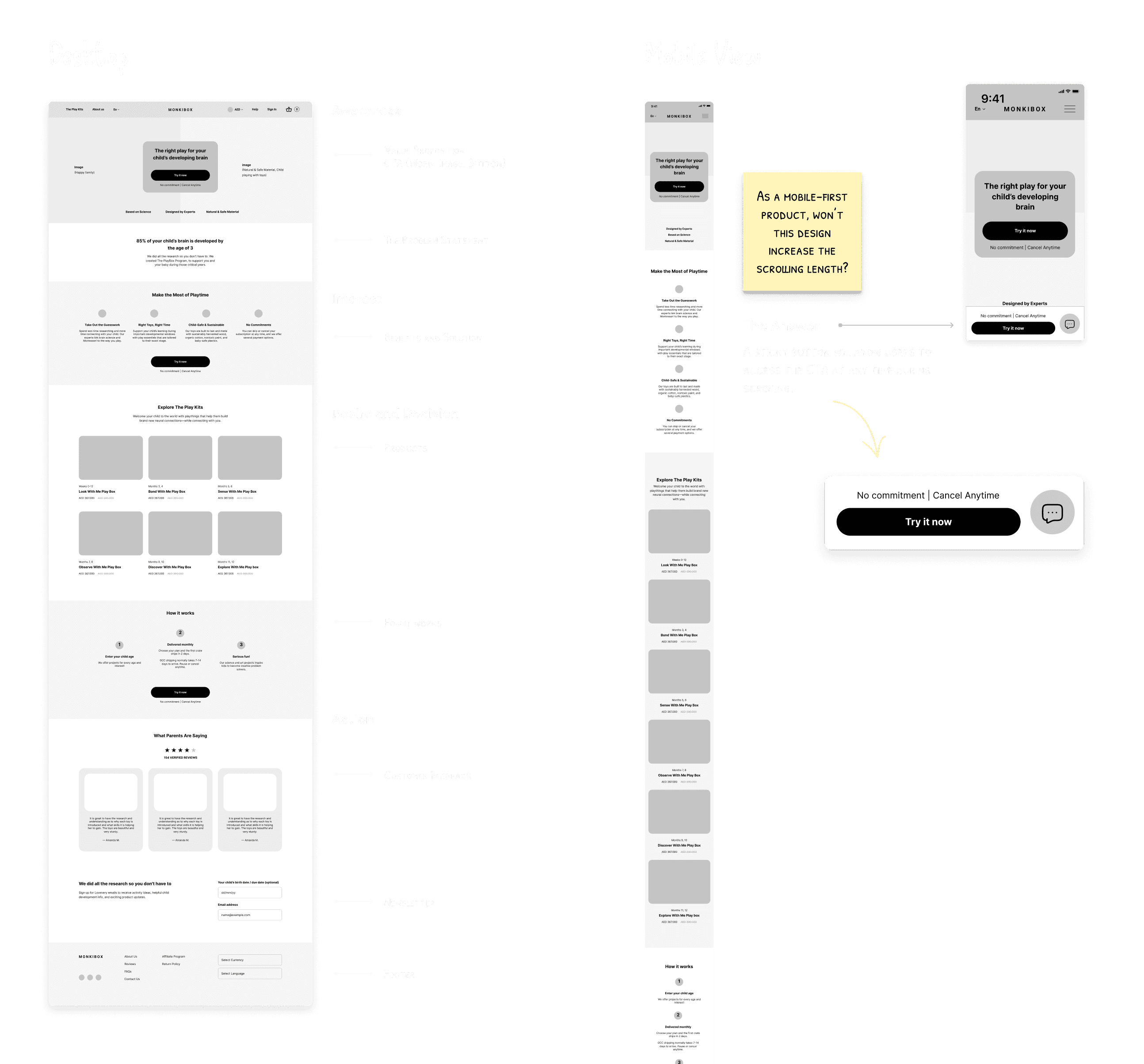
Wireframing
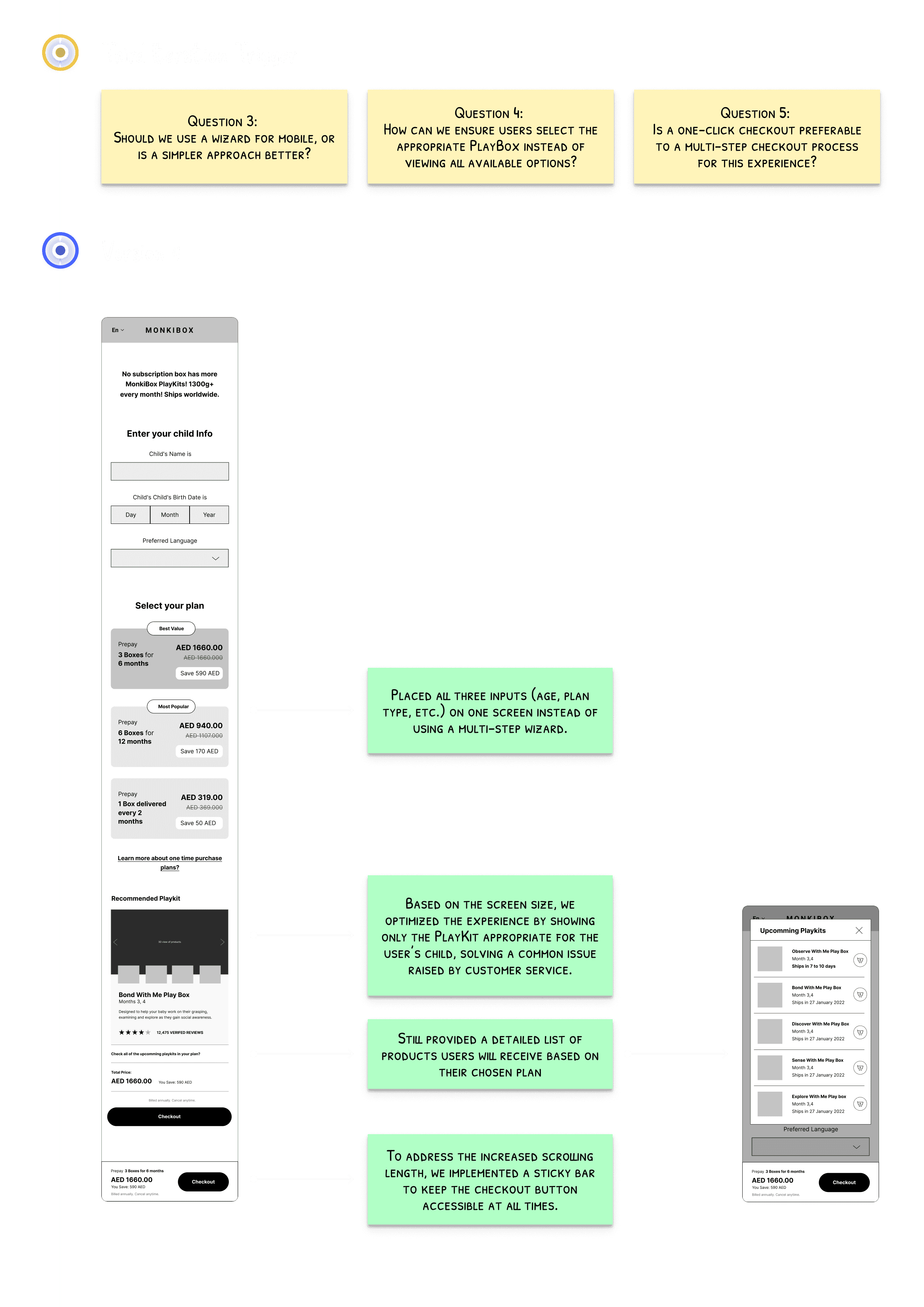
Given that 70% of users accessed the site via mobile, we followed a mobile-first design approach. I structured the homepage using the AIDA Model (Attention, Interest, Desire, Action) to reduce the amount of scrolling and simplify the navigation.
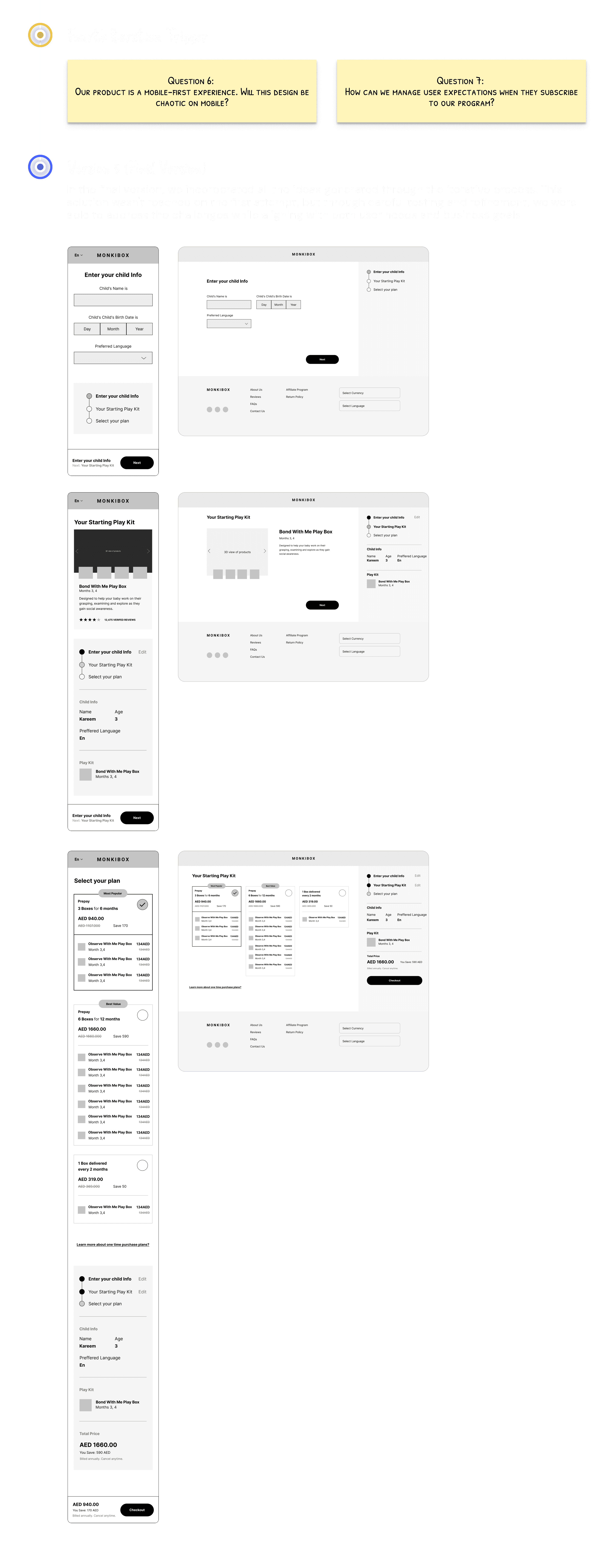
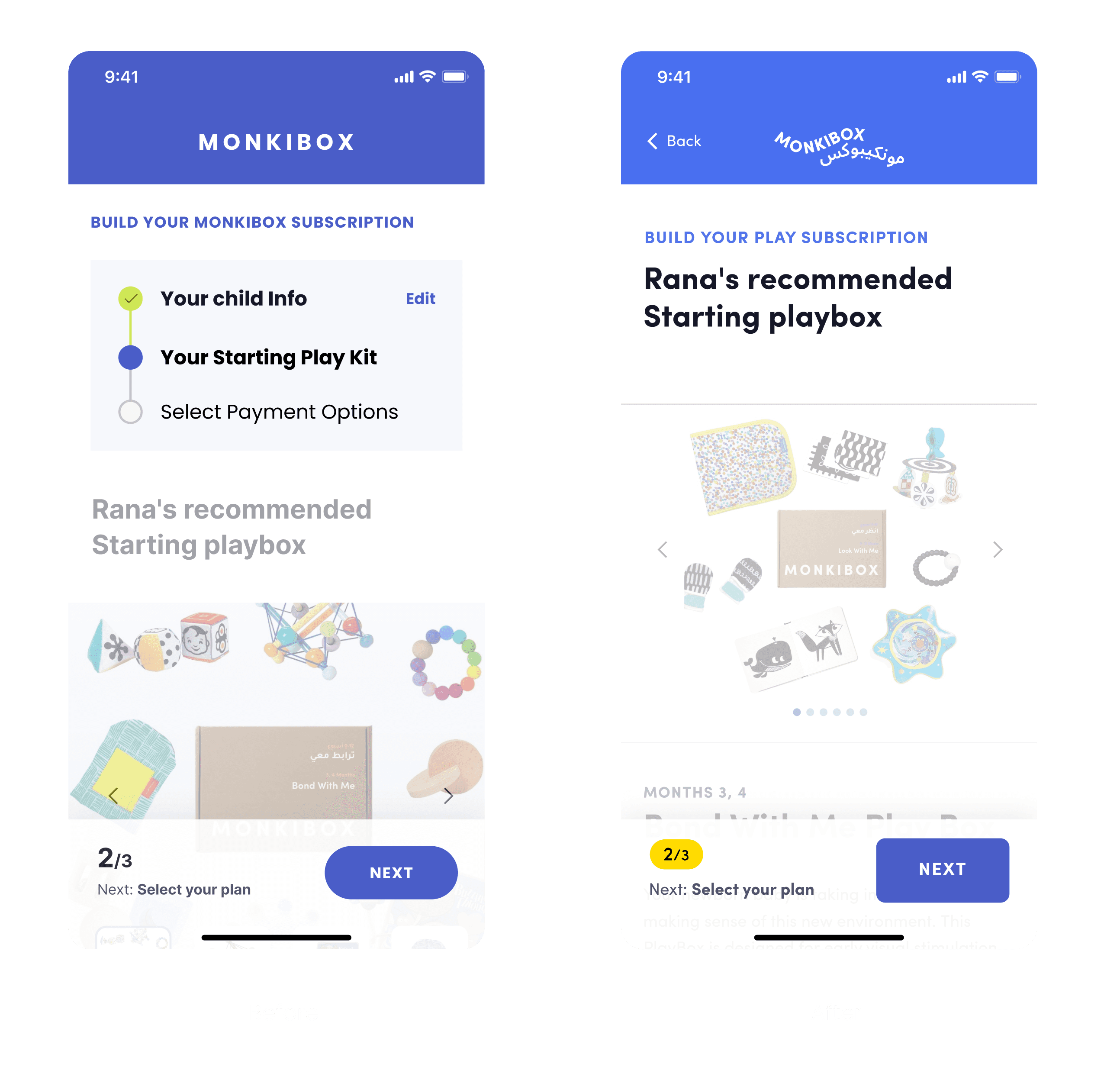
Subscription Plan Design and Iterations
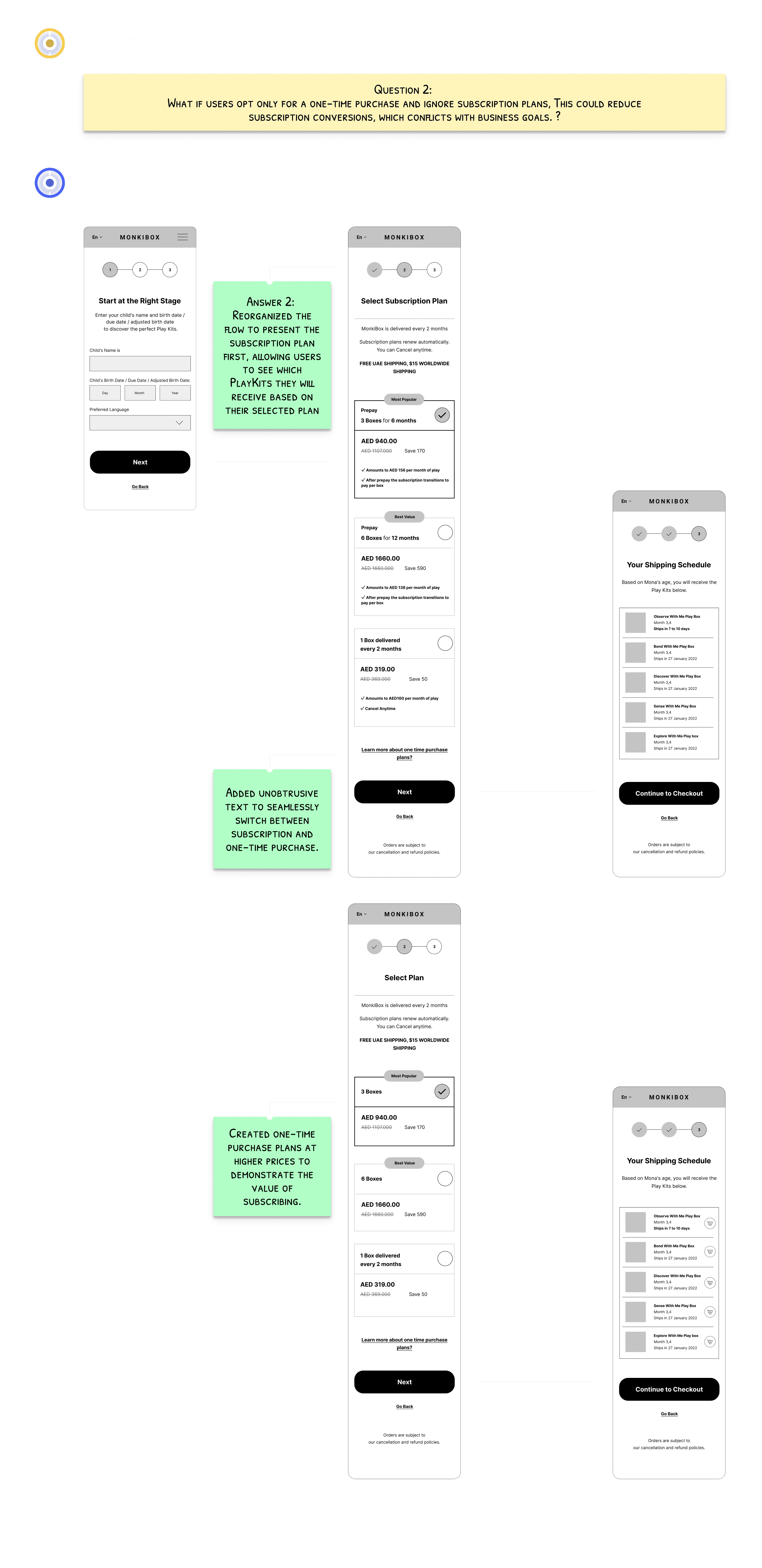
Through a Q&A journey, I developed a version that addresses and incorporates most customer and business goals and needs.
Usability Testing
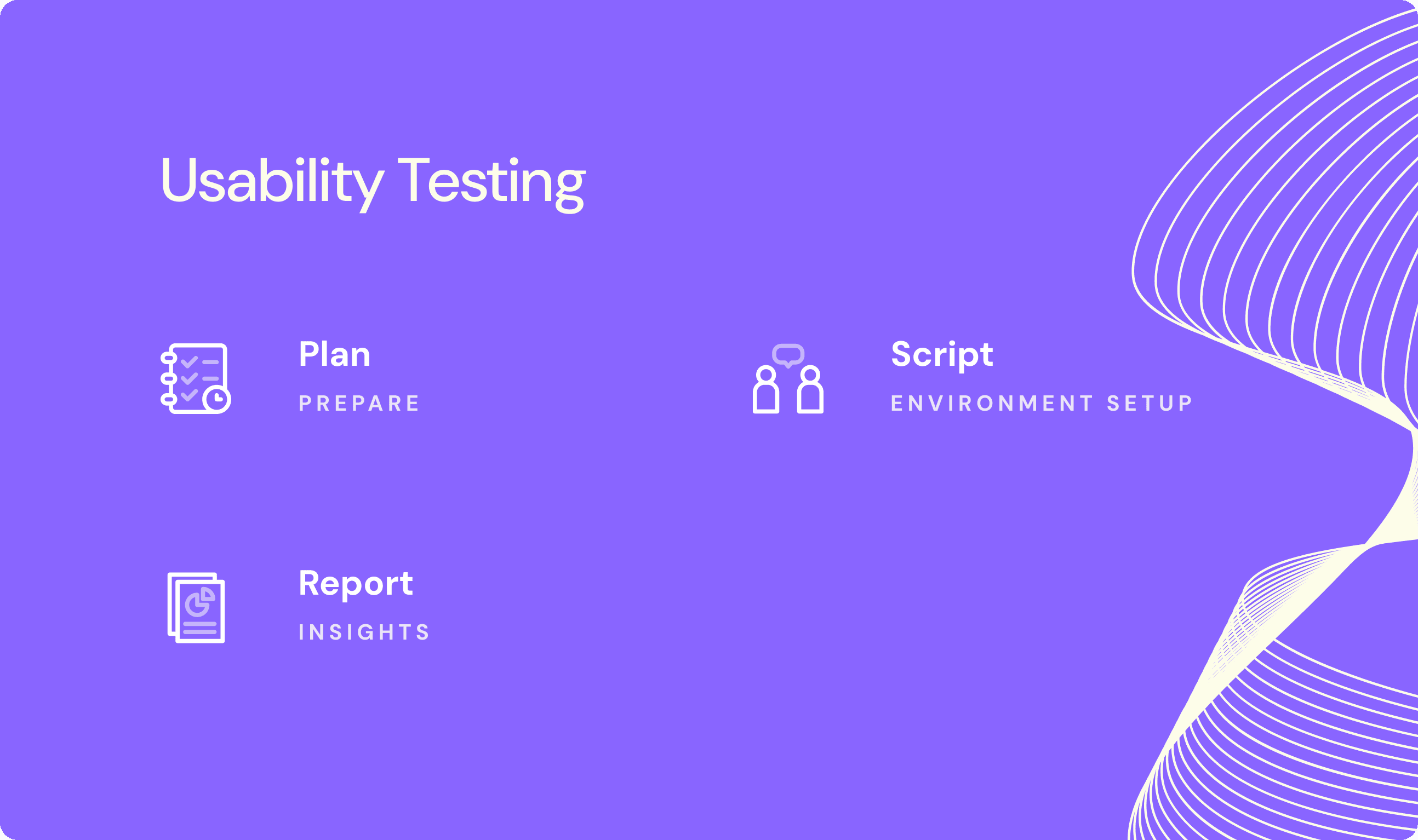
Plan
In preparation for usability testing, I initially discussed with the manager the idea of testing the designs using wireframes. However, we decided to create an incomplete high-fidelity prototype to conduct the tests since the branding was not yet finalized. To maintain visual consistency, I selected colors and visuals that closely matched the brand's identity.
Test Versions
We planned to test two versions of the subscription flow to determine which would provide a better user experience:
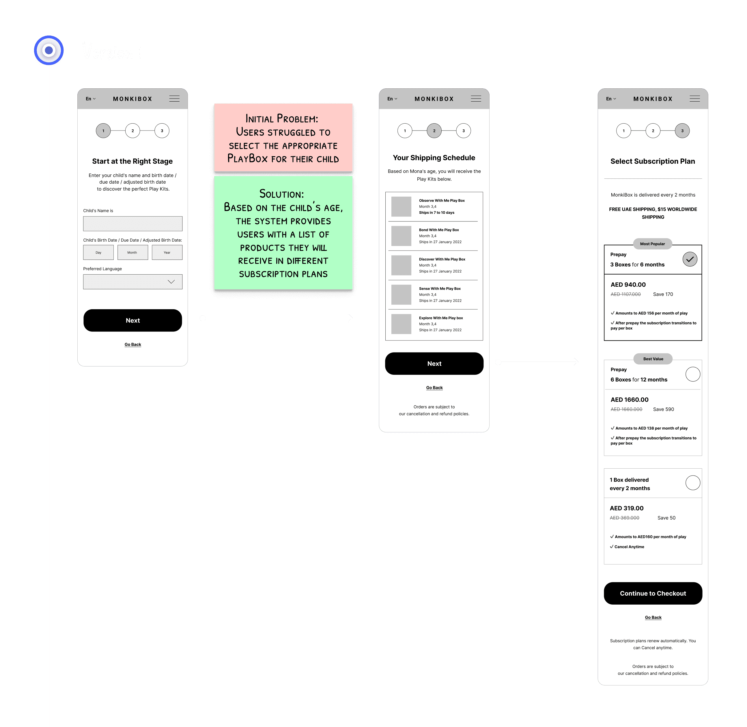
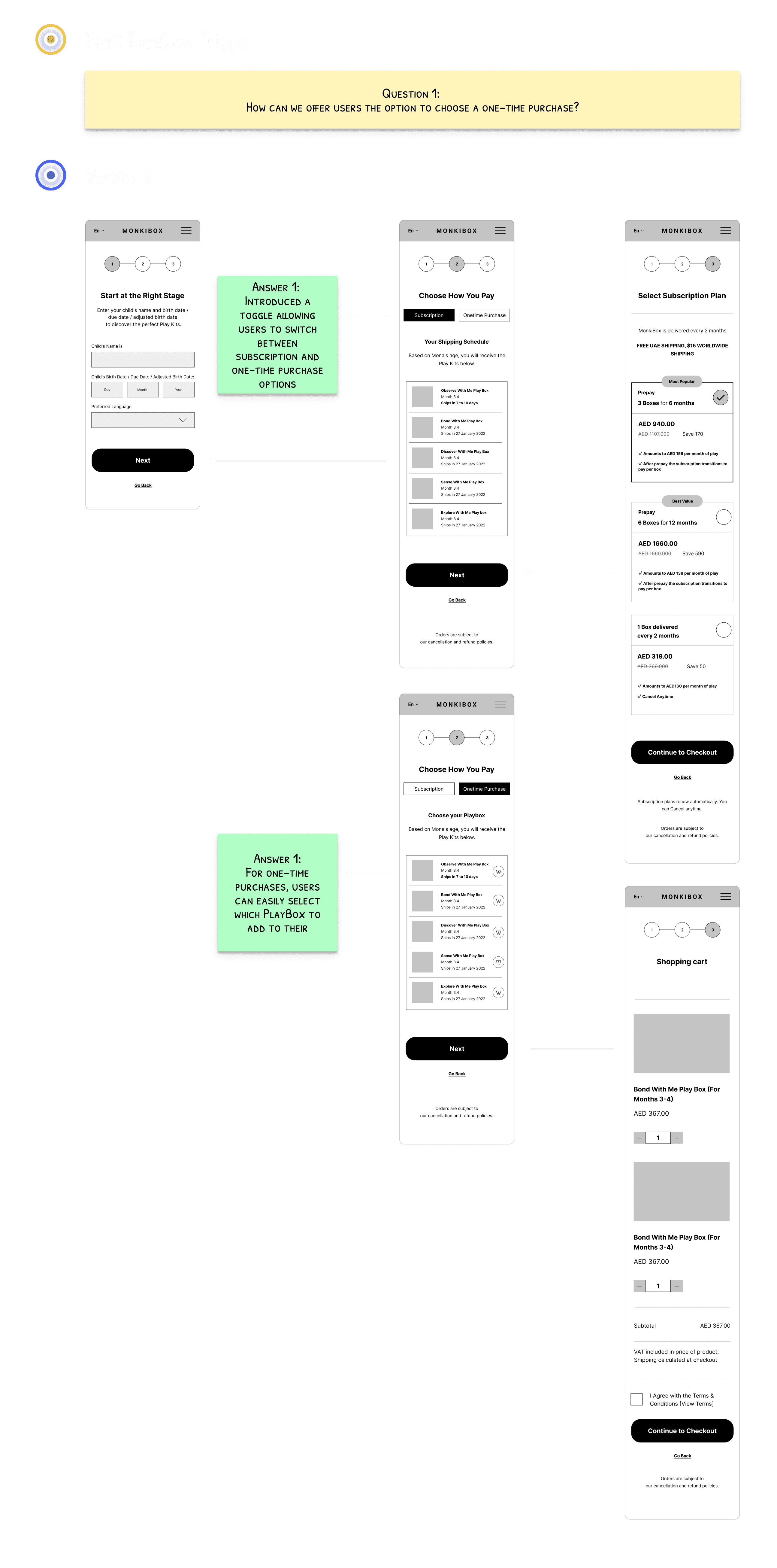
Version 1:
Users are first shown the recommended PlayBox based on their child’s age, and then they choose a subscription plan.Version 2:
Users first select a subscription plan, after which they are shown a list of available PlayBoxes, starting with the one recommended for their child's age.
Key Differences
Version 1 provides users with additional information by showing the recommended PlayBox before they select a plan.
Version 2 offers fewer customization options for one-time purchases, limiting users to select only from the available PlayBoxes.
Both versions include the shipping schedule.
Testing Method
Due to budget constraints and the availability of our target customers, we opted for unmoderated usability testing. We decided to move forward with an incomplete high-fidelity prototype, focusing on testing the two subscription flow versions with parents. This approach allowed us to gather valuable insights while we waited for the final branding to be completed.
in-completed high-fidelity prototype prepared for testing.
Documenting the Usability Testing Plan
To ensure a thorough and well-structured approach, I documented all hypotheses and key questions that needed validation, along with the specific goals we aimed to achieve. This documentation was shared with stakeholders for review and approval before proceeding.
The usability testing script included the following key components:
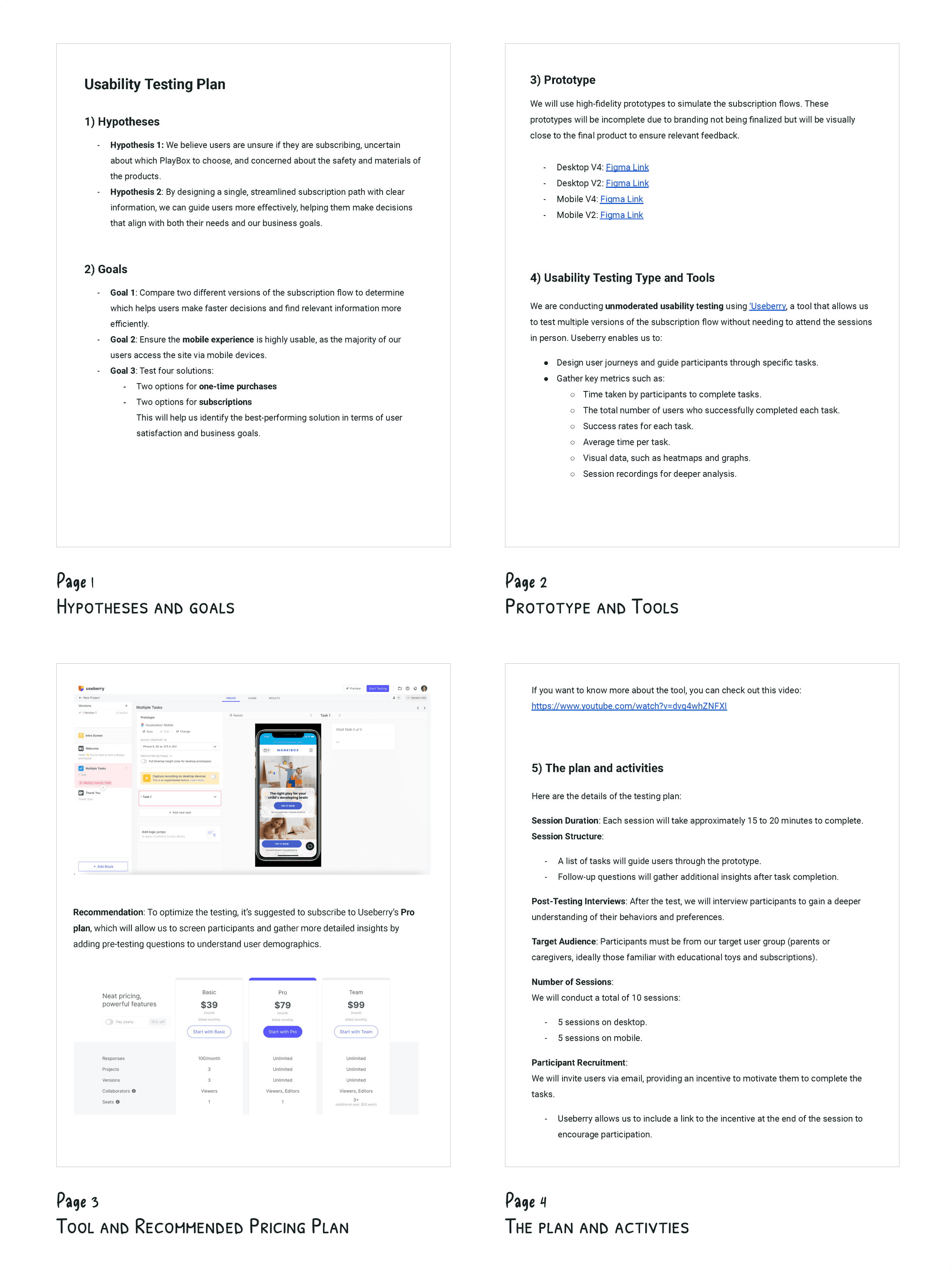
Script
The usability testing script was implemented directly on the platform and continuously evolved throughout the process. The setup included the following key components:
Instruction Slide:
Provided participants with an overview and guidance before starting the tasks.Task Setup for Each Platform:
Separate links were created for desktop and mobile users, directing participants to the appropriate device for their testing session.Follow-up Feedback:
Four post-task questions to gather follow-up insights from participants.
While I wasn’t responsible for recruiting participants, the manager took charge of this by bringing in participants from a mothers' community. I recommended that participants be asked to speak aloud while performing the tasks, so we could capture their real-time thoughts and reactions.
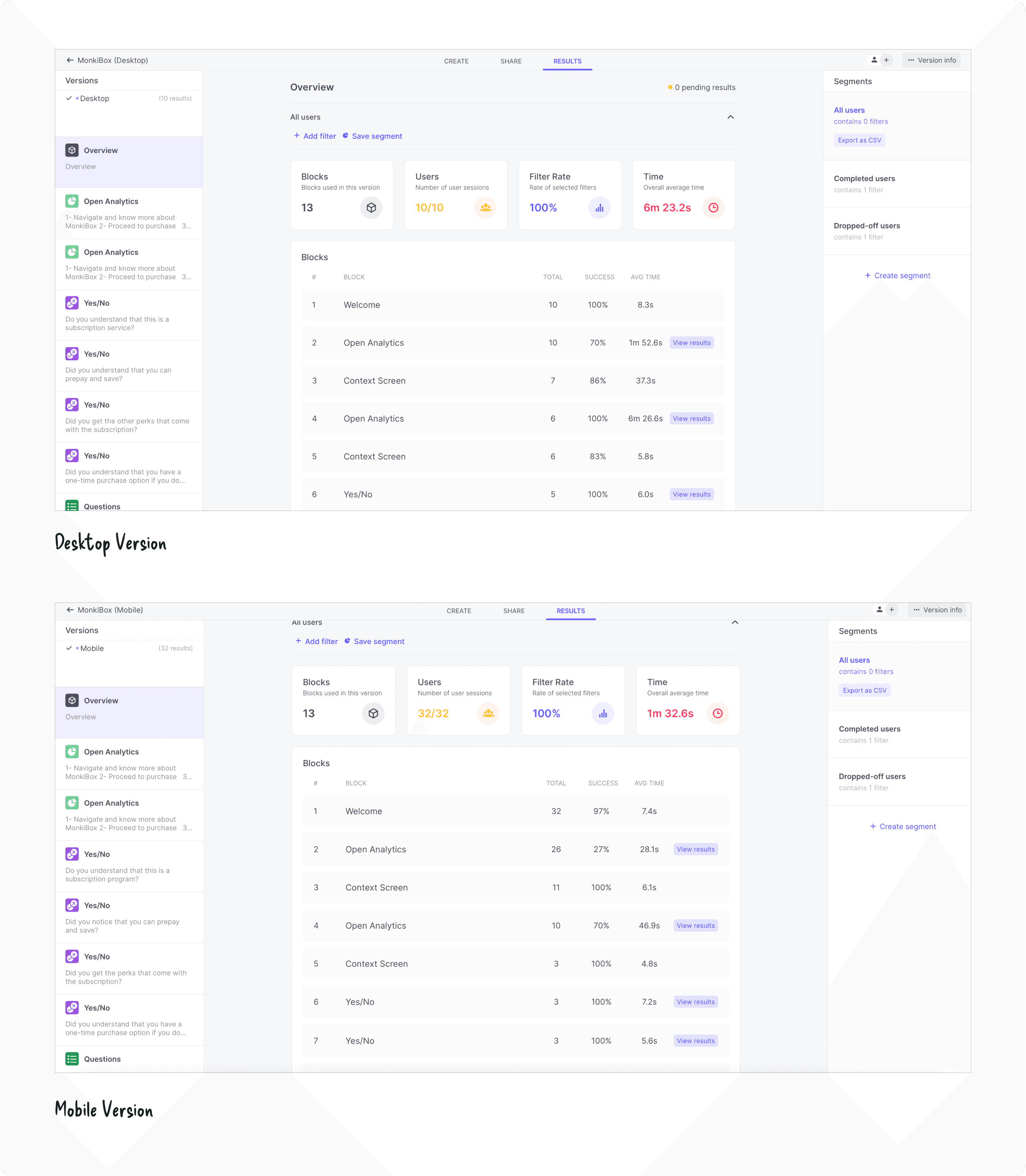
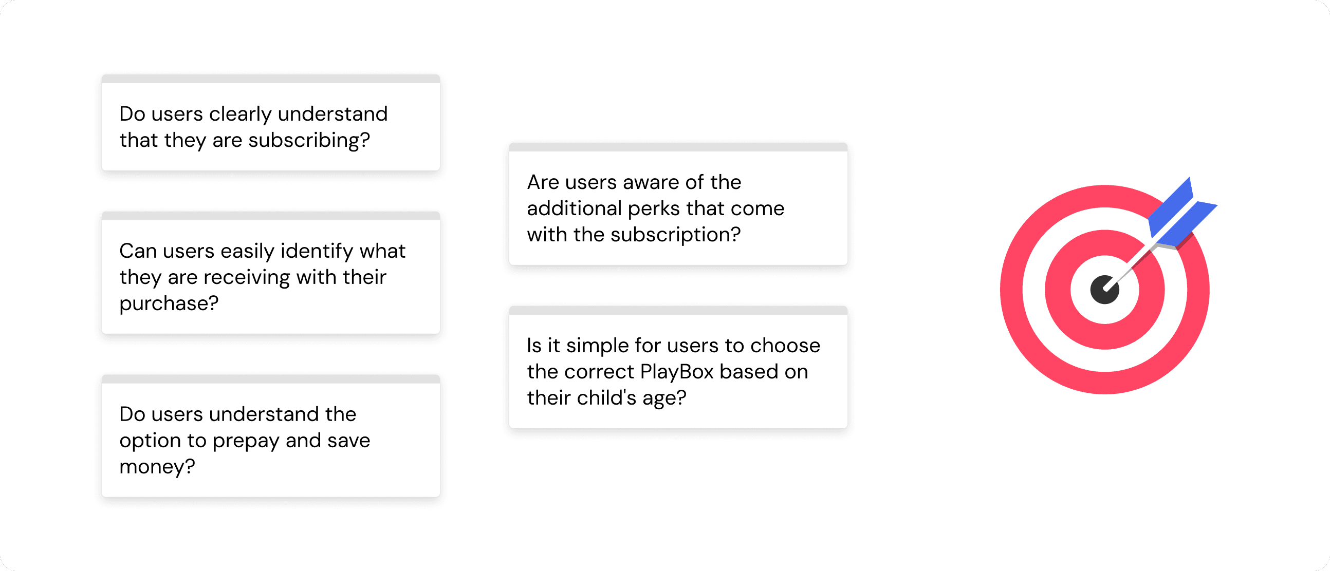
Report
I compiled all the insights from the usability testing and shared them with stakeholders, along with actionable recommendations based on the findings.
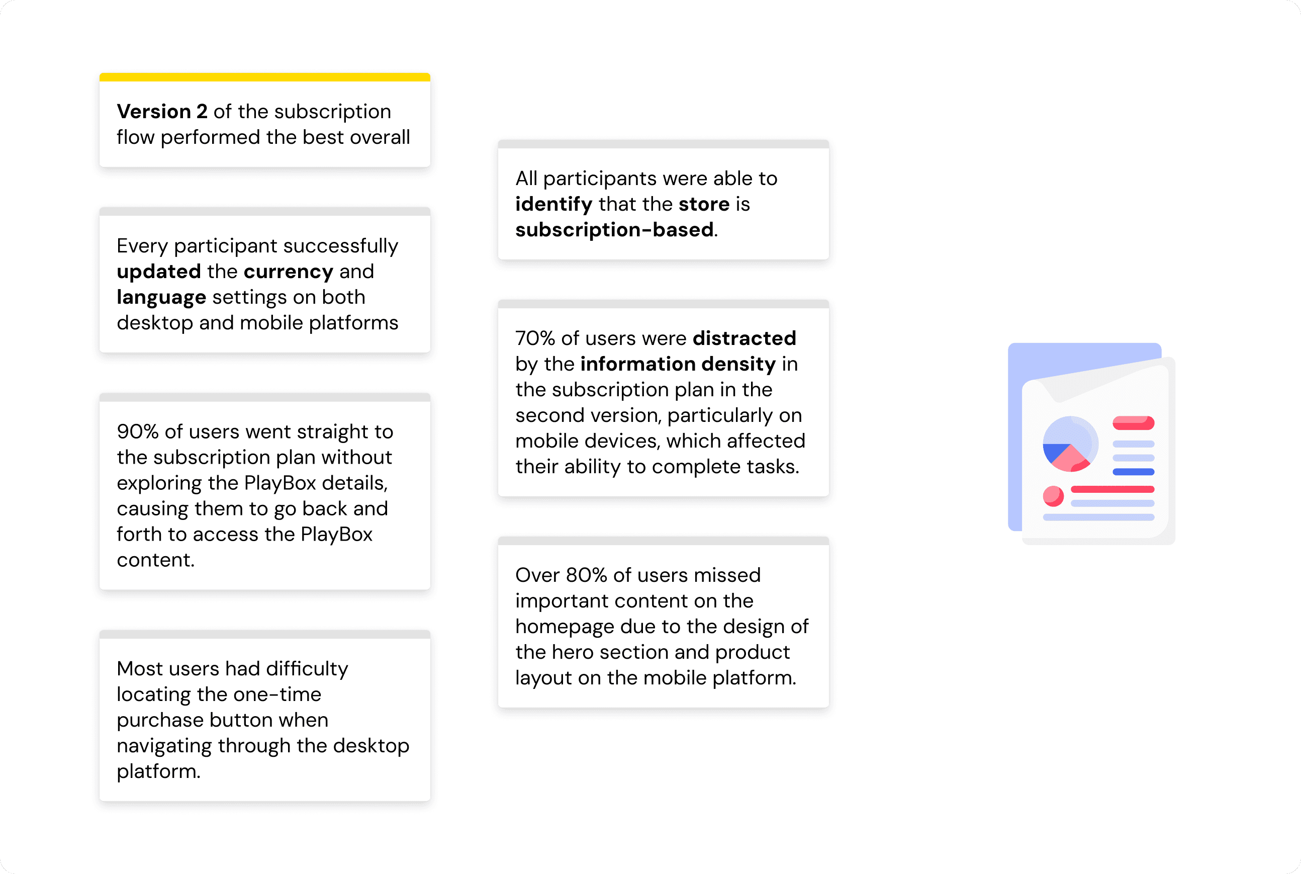
The key insights.
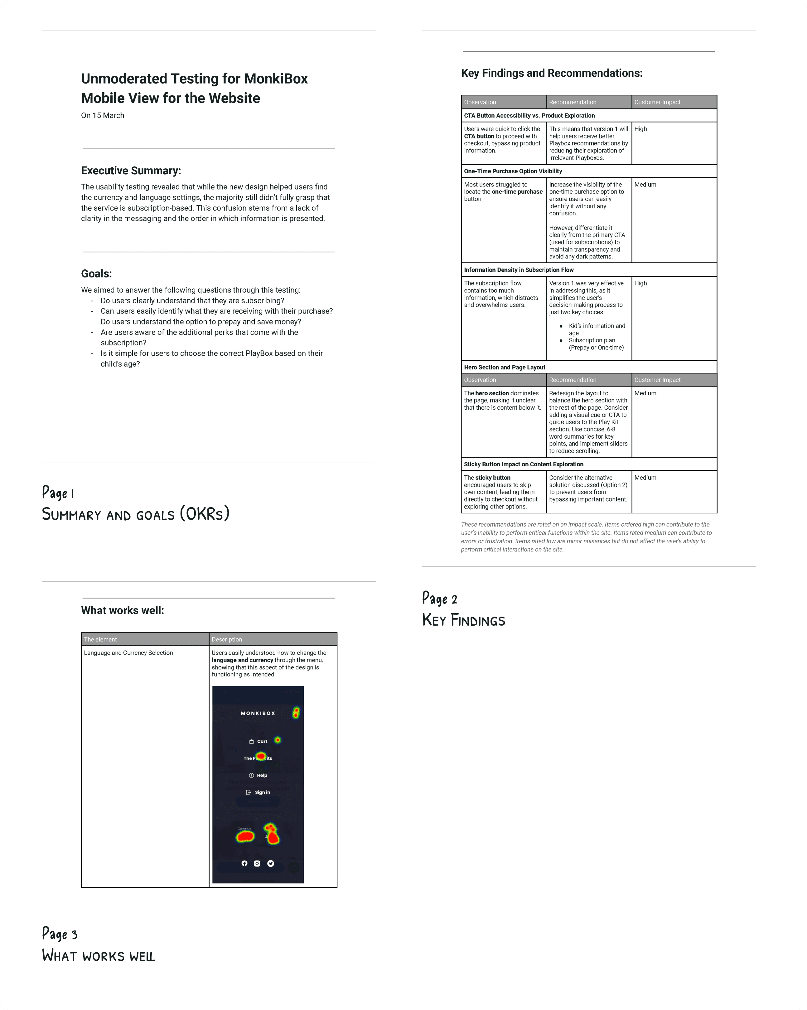
The usability testing report I prepared to send to the stakeholders.
Iteration
Final Version
The final version of the mobile-responsive design.
The final version of the desktop design.
Discovery
Stakeholder Interviews
To understand the key issues, I applied the 5 Whys Technique during stakeholder interviews to dig deeper into the problems:
Business Problem: The client needed to update their Shopify design and subscription flow to improve the purchasing experience for parents.
Core Issue: Customers were being unintentionally enrolled in subscriptions due to a confusing purchasing process with multiple paths (standard purchase, subscription, and gifting).
Additional Questions
I also asked stakeholders additional questions to gain deeper insights into the business model, target audience, and user pain points.
Setting OKRs
Based on these discussions, we established OKRs to measure the success of the redesign.
Some of the information we gathered came from the sales team, who are familiar with the common questions customers ask. For example, one recurring concern from parents is whether the products are made from materials that could contain sharp edges or other hazards that might harm their baby.
Website Analysis
To verify user behaviors and conversion issues, I conducted an analysis using Google Analytics. By leveraging the Funnel Visualization tool, I identified key problem areas in the checkout process, particularly around confusion over subscription and product purchases.
Conversion rate: 2%
High mobile usage: 70% of users came from mobile, mostly through Instagram, highlighting the need for a mobile-first redesign.
Researching conversion rates and user behavior, then documenting the findings in the customer journey map.
Define
Customer Journey Map
A customer journey map was created to visualize the different touchpoints and phases that users experience, from discovery to checkout. This map helped identify opportunities for improvement in navigation, subscription clarity, and user engagement.
Research Insights
Based on my research, I identified the following insights:
Competitors Research
I conducted a competitor analysis to understand how other brands address similar challenges. Key insights included:
Lovevery:
Strong brand identity with clear product showcasing and supportive guides throughout the journey.MontiPlay:
Good use of video tutorials and long-range subscription formats but poor UX practices.MontiKids:
Comprehensive educational programs but limited subscription flexibility.KiwiCo:
Engaging visuals and broad product offerings, but difficult access to product information for specific age groups.
1. Conducting an in-depth audit of competitors and their mobile app designs.
2. Summarizing each competitor's strengths and weaknesses.
3. Comparison of Strengths and Weaknesses.
Prioritization
We prioritized features and solutions based on their impact and effort. Features that offered the highest impact with the least effort were prioritized for implementation, such as clear subscription explanations, reassuring tags, and improved mobile navigation.
Competitor Strengths List
Matrix prioritization of competitor strengths was completed in collaboration with stakeholders to prioritize strengths that can be incorporate into our product and platform.
Design
Wireframing
Given that 70% of users accessed the site via mobile, we followed a mobile-first design approach. I structured the homepage using the AIDA Model (Attention, Interest, Desire, Action) to reduce the amount of scrolling and simplify the navigation.
Subscription Plan Design and Iterations
Through a Q&A journey, I developed a version that addresses and incorporates most customer and business goals and needs.
Usability Testing
Plan
In preparation for usability testing, I initially discussed with the manager the idea of testing the designs using wireframes. However, we decided to create an incomplete high-fidelity prototype to conduct the tests since the branding was not yet finalized. To maintain visual consistency, I selected colors and visuals that closely matched the brand's identity.
Test Versions
We planned to test two versions of the subscription flow to determine which would provide a better user experience:
Version 1:
Users are first shown the recommended PlayBox based on their child’s age, and then they choose a subscription plan.Version 2:
Users first select a subscription plan, after which they are shown a list of available PlayBoxes, starting with the one recommended for their child's age.
Key Differences
Version 1 provides users with additional information by showing the recommended PlayBox before they select a plan.
Version 2 offers fewer customization options for one-time purchases, limiting users to select only from the available PlayBoxes.
Both versions include the shipping schedule.
Testing Method
Due to budget constraints and the availability of our target customers, we opted for unmoderated usability testing. We decided to move forward with an incomplete high-fidelity prototype, focusing on testing the two subscription flow versions with parents. This approach allowed us to gather valuable insights while we waited for the final branding to be completed.
in-completed high-fidelity prototype prepared for testing.
Documenting the Usability Testing Plan
To ensure a thorough and well-structured approach, I documented all hypotheses and key questions that needed validation, along with the specific goals we aimed to achieve. This documentation was shared with stakeholders for review and approval before proceeding.
The usability testing script included the following key components:
Script
The usability testing script was implemented directly on the platform and continuously evolved throughout the process. The setup included the following key components:
Instruction Slide:
Provided participants with an overview and guidance before starting the tasks.Task Setup for Each Platform:
Separate links were created for desktop and mobile users, directing participants to the appropriate device for their testing session.Follow-up Feedback:
Four post-task questions to gather follow-up insights from participants.
While I wasn’t responsible for recruiting participants, the manager took charge of this by bringing in participants from a mothers' community. I recommended that participants be asked to speak aloud while performing the tasks, so we could capture their real-time thoughts and reactions.
Report
I compiled all the insights from the usability testing and shared them with stakeholders, along with actionable recommendations based on the findings.
The key insights.
The usability testing report I prepared to send to the stakeholders.
Iteration
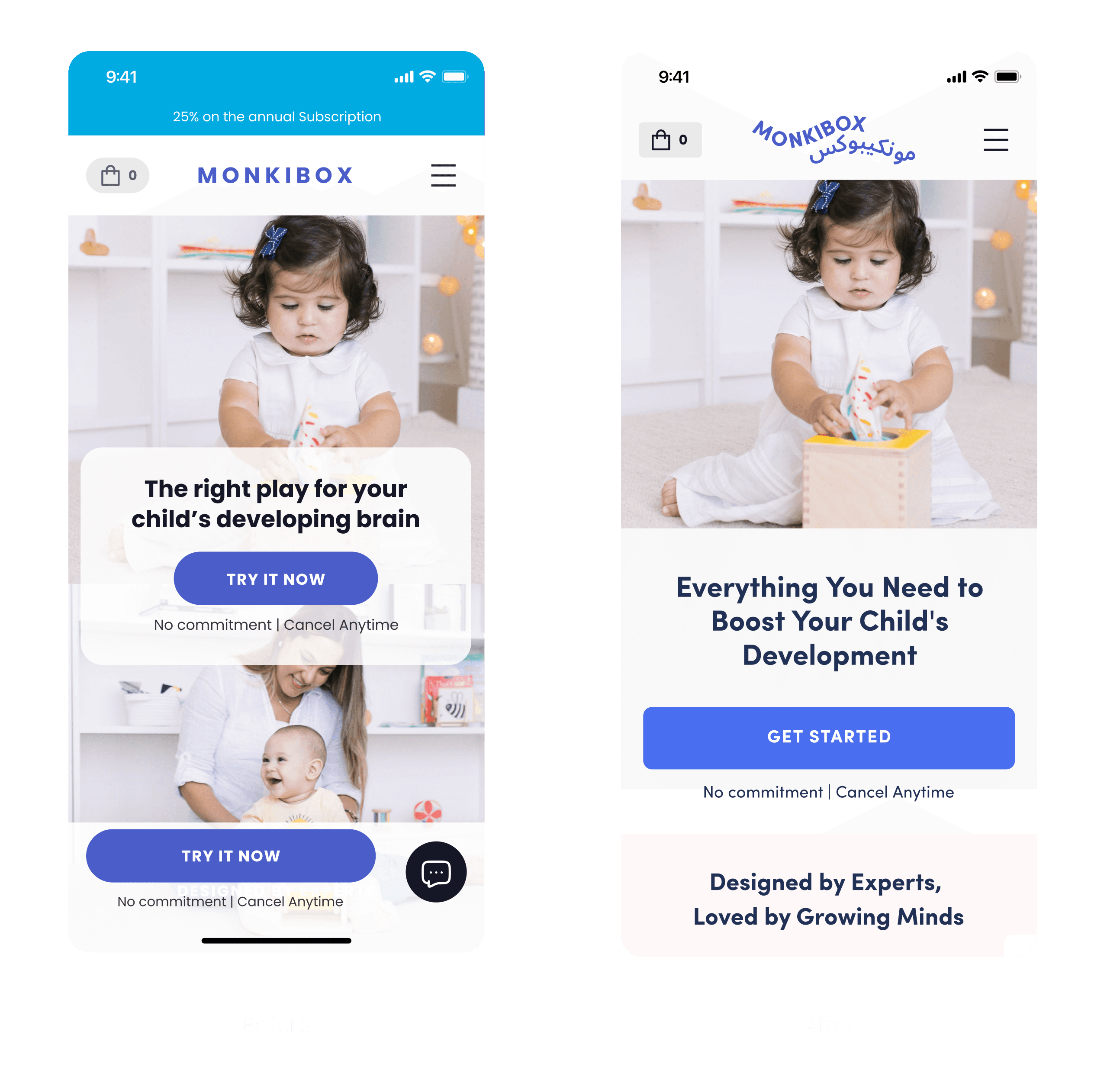
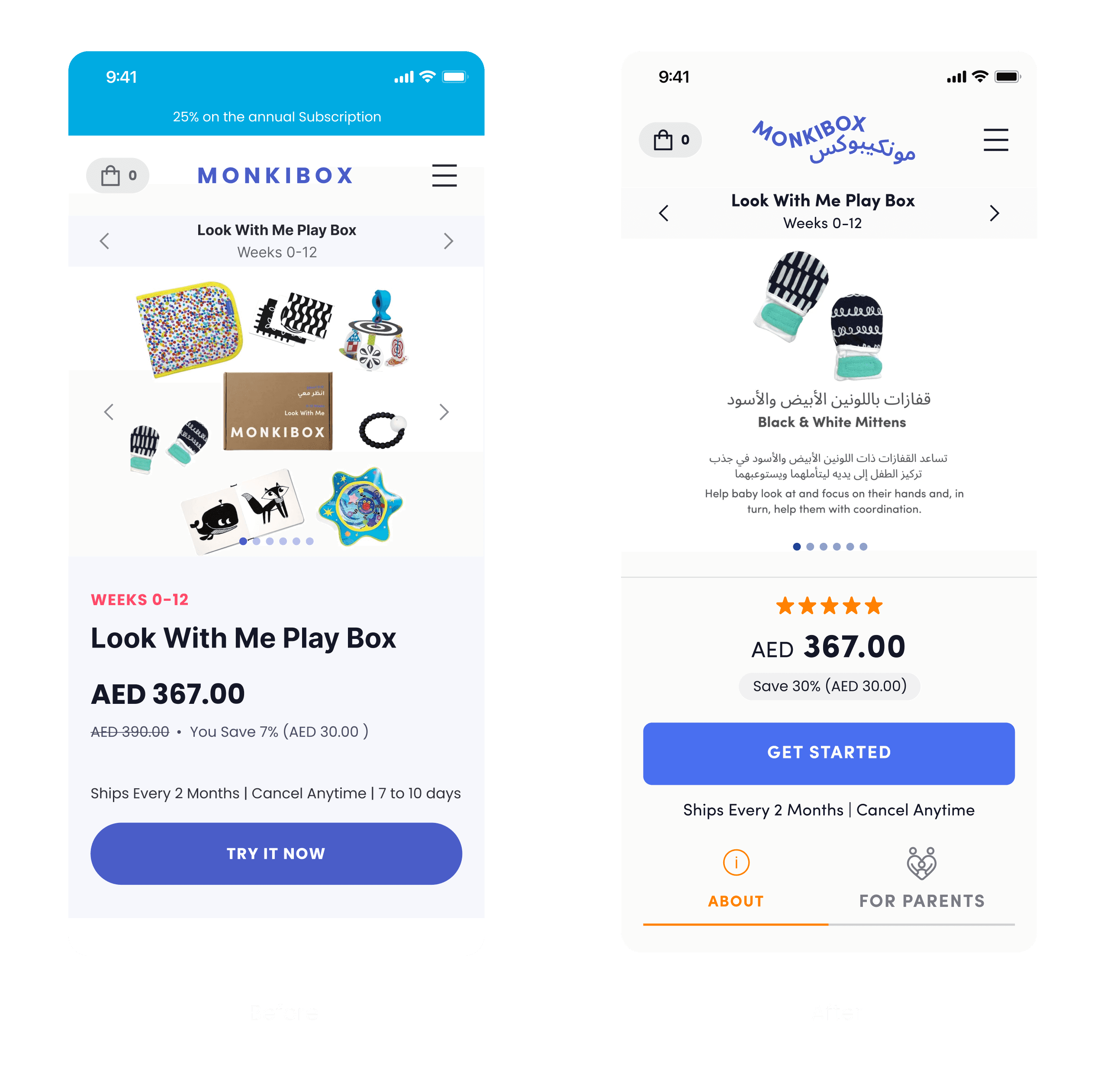
Final Version
The final version of the mobile-responsive design.
The final version of the desktop design.